20+ AI Interior Design Prompts for Rooms That Look Staged (2026)
Twenty-plus tested AI interior design prompts for living rooms, kitchens, bedrooms and home offices — plus the five moves that make a render look professionally styled instead of like a generic showroom.
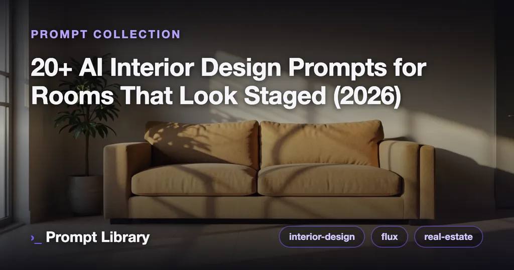
Type “modern living room” into any image model and you get the same render everyone else does: a grey sofa, a fiddle-leaf fig, a blank wall, and lighting so even the room looks like a furniture catalog. It’s fine. It’s also instantly forgettable — and useless if you’re staging a real listing, testing a renovation, or building a mood board a client will actually react to.
The gap between a generic room and one that looks designed isn’t the model. It’s a handful of specific moves that real interior stylists make and most prompts skip. Below are the five that matter most, then twenty-plus tested prompts across every room — seven copy-paste ones embedded here, plus the full interior-design hub with two dozen more, each published with its exact settings. Most are tested with Flux.1 dev, which reads natural window light and material texture more faithfully than anything else right now.
The five moves that make a room look designed
1. Anchor the palette to one warm neutral. Designed rooms almost always run one warm neutral wall-to-wall — greige walls, an oatmeal sofa, pale oak — and layer accents on top of it. If you name three bold colors, the model spreads them evenly and the room reads like a daycare. Name one anchor, then one or two accents “as accents only.”
2. Specify the light by time, not brightness. “Natural light” is the single most wasted phrase in interior prompting. Hard midday sun flattens a room to grey; low, warm, late-afternoon light rakes across surfaces and makes the wood grain and textile weave visible — and that texture is what sells the space as real. Say late-afternoon window light, long soft shadows.
3. Give the room one hero material. A designer picks a protagonist — a travertine coffee table, a walnut slat wall, a boucle chair — and keeps everything around it restrained. Prompt the hero explicitly and the render gets a focal point; list five materials and it becomes a showroom with no soul.
4. Cap the clutter, on purpose. Left alone, models fill every shelf and surface. Real styling is subtractive. Add one statement plant, minimal decor, uncluttered surfaces and the room gains the calm that reads as expensive.
5. Frame it like a real estate photo. eye-level, 24mm, one wall visible, shot from the doorway gives you the honest three-quarter view a listing photographer uses — far more convincing than the impossible floating-corner angle models default to.
Living rooms: anchor the palette
The living room is where the one-warm-neutral rule earns its keep. This Japandi render leans on pale oak and a single oatmeal seat; notice how restrained the accent count is — that restraint is the whole look.
Swap the anchor and the mood follows. A coastal version keeps the same discipline but trades oak warmth for whitewashed, breezy neutrals — same rules, different protagonist.
Kitchens: lead with one hero surface
Kitchens tempt you to describe every appliance. Don’t. Name the counter material — the hero — and let the cabinetry stay quiet. Here the stone island is the protagonist and the dawn light gives the metal and marble something to catch.
For real-estate work, the same prompt structure doubles as virtual staging — an empty or dated kitchen re-dressed into something aspirational. Keep the architecture plausible and the fixtures believable; buyers spot a fantasy kitchen instantly.
Bedrooms: layer the textiles
Bedrooms live or die on soft goods. A designed bedroom stacks three or four textures in one tonal family — linen duvet, wool throw, boucle bench — rather than one flat bedspread. Name the textiles and the tonal family; let the palette stay narrow.
Home offices & reading nooks
Smaller spaces are the easiest to make look styled because there’s less to control. A home office reads professional the moment you add real daylight and a single plant instead of the usual RGB-lit cave.
Nooks are pure mood — one seat, one light source, one texture. This window seat works because it commits to a single warm light and resists the urge to decorate.
Using these for virtual staging and renovations
If you’re staging listings or previewing a remodel, two extra rules keep renders credible. First, keep the bones fixed — real window placement, real ceiling height, real doorways — and only restyle the finishes and furniture; a render that moves a load-bearing wall is worse than no render. Second, match the light to the actual listing photos so the staged shots don’t clash with the real ones. For a deeper workflow (and which tools handle it best), see our guide to the best AI tools for real estate and interiors and the broader real-estate marketing prompts playbook. Interiors skew wide — landscape framing dominates this category, which the corpus data bears out.
What’s the best AI model for interior design renders?
For photoreal interiors, Flux.1 dev is the strongest default: it handles natural window light, material texture, and believable perspective better than the alternatives, which is why most prompts in our interior-design hub target it. Midjourney v7 wins when you want a polished, magazine-editorial mood board rather than a literal room — its renders look styled-for-a-shoot out of the box, at the cost of some architectural accuracy. Stable Diffusion (SDXL) is the pick when you need to run many variations locally or inpaint a specific wall or fixture. Rule of thumb: Flux for staging a real space, Midjourney for aspiration, SDXL for control.
Liked these prompts? Get the free pack
Subscribe and get the free pack of 25 tested prompts — then one email a week with the best new tested prompts and model news. No spam, unsubscribe anytime.